Card components - iOS
Prerequisites
Before implementing card components, ensure you have:
- Initialised the Weavr SDK
- Valid API credentials
Components
1. Card number component (UILabel)
Card number component shows the full 16-digit card number to your customers.
Once you have installed and initialised Weavr Mobile SDK, you can integrate to the Card number component.
You need to include the components in your app either adding programmatically or using Storyboard.
- Programmatically
- Storyboard
lazy var secureLabel: SecureCardNumberLabel = {
        let label = SecureCardNumberLabel()
        label.frame = CGRect(x: 10, y: 20, width: 300, height: 60)
        label.backgroundColor = .red
        return label
    }()
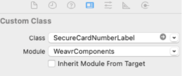
This can be achieved by dragging and dropping the UILabel component to your storyboard. In the Identity inspector, cast the type to SecureCardNumberLabel in the Class block.
Tokenisation
Once you have implemented SecureCardNumberLabel, it has inbuilt tokenising capability, which returns a token after successful completion
self.secureLabel.setTokeniseText(toDetokenise: "tokenizedCardNumber" , callback: { res in
    switch res {
        case .success(let data):
            print(data!)
        case .failure(let error):
            print(error.message ?? "")
    }
})
Vertical card number display
You can display a card number using vertical alignment, by adding the following line of code:
self.SecureCardNumberLabel.isVertical = true
The card number would show as:
5412
1234
5678
9012
2. CVV component (UILabel)
CVV Component shows the 3-digit number that is needed to make online purchases using cards.
Once you have installed and initialised Weavr Mobile SDK, you can integrate to the CVV label component.
You need to include the components in your app either adding programmatically or using Storyboard.
- Programmatically
- Storyboard
    lazy var cvvLabel: SecureCVVLabel = {
            let label = SecureCVVLabel()
            label.frame = CGRect(x: 10, y: 20, width: 300, height: 60)
            return label
        }()
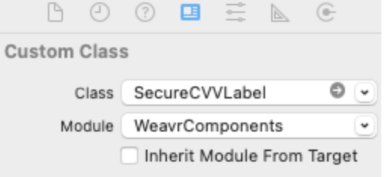
This can be achieved by dragging and dropping the UILabel component to your storyboard. In the Identity inspector, cast the type to SecureCardNumberLabel in the Class block.
Tokenisation
Once you have implemented SecureCVVLabel, it has inbuilt tokenising capabilities, which returns a token after successful completion as above.
3. Card PIN view component (UILabel)
Card PIN component shows the 4-digit PIN number needed to make in-person purchases using cards
You only need to use this component if you are issuing physical cards.
Once you have installed and initialized Weavr Mobile SDK, you can integrate to the card PIN label component.
You need to include the components in your app either adding programmatically or using Storyboard.
- Programmatically
- Storyboard
    lazy var showCardPinLabel: SecureCardPinLabel = {
        let label = SecureCardPinLabel()
        label.frame = CGRect(x: 10, y: 20, width: 300, height: 60)
        label.backgroundColor = .red
        return label
    }()
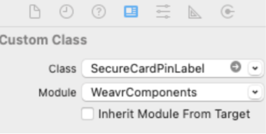
This can be achieved by drag and drop the UILabel component to your storyboard. And in the Identity inspector , cast the type to SecureCardPinLabel in the Class block.
Tokenisation
Once you have implemented SecureCardPinLabel, it has inbuilt tokenising capability, which returns a token after successful completion
self.showCardPinLabel.setTokeniseText(toDetokenise: "tokenizedCardNumber" , callback: { res in
    switch res {
    case .success(let data):
        print(data!)
    case .failure(let error):
        print(error.message ?? "")
    }
 })
4. Card PIN set component (UITextfield)
Capture card PIN component collects your customer's defined physical card PIN
Due to requirements related to strong customer authentication, your authentication token is required to be stepped-up before calling this component.
Once you have installed and initialized Weavr Mobile SDK, you can integrate to the capture card PIN label component.
You need to include the components in your app either adding programmatically or using Storyboard.
- Programmatically
- Storyboard
lazy var securedPinField: SecureCardPinField = {
    let field = SecureCardPinField()
    field.frame = CGRect(x: 10, y: 20, width: 300, height: 60)
    field.backgroundColor = .red
    return field
}()
This can be achieved by dragging and dropping the UILabel component to your storyboard. In the Identity inspector, cast the type to SecureCardPinLabel in the Class block.
Important notes
-
PIN Requirements:
- PIN must be exactly 4 digits
- Only numeric input is allowed
- Input is masked for security
-
Card Number Display:
- Vertical display shows 4 digits per line
- Horizontal display shows all digits in one line
- Format can be toggled using
isVerticalproperty
-
Security Features:
- All sensitive data is automatically tokenised
- No sensitive data is stored in memory
- Components are PCI DSS compliant
- Secure communication with backend services