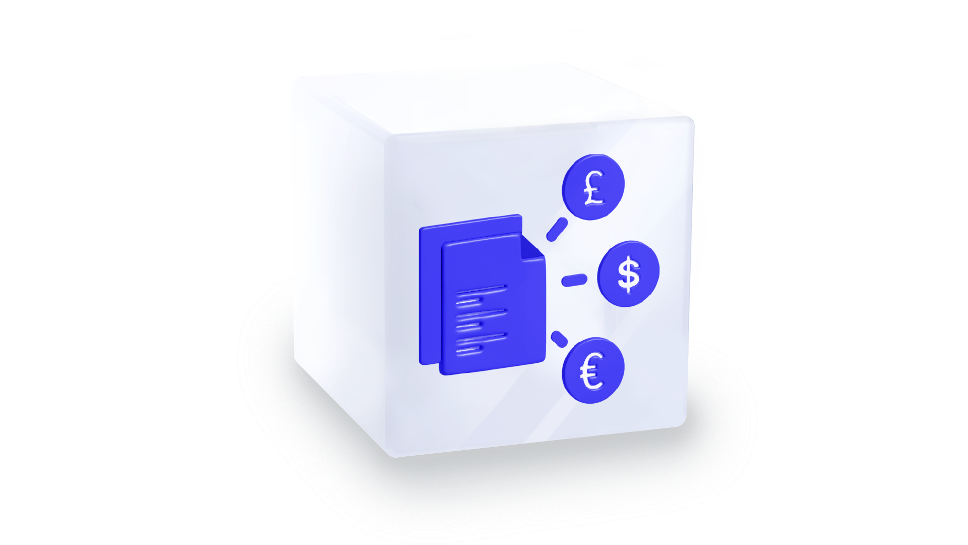
Payment Initiation Service (PIS) Component

Overview

The Payment Initiation Service (PIS) is an embeddable UI Component that is initiated to fund a payment run from a linked bank account. When initiating the PIS UI Component, users will be prompted to:

  • Consent a Payment : The end-user needs to consent for a single funding request. The funding information will be displayed in the component.
Sweeping Consent

When a linked account is used for the first time, the user will also be prompted to sweep funds from their zero balance account back to their linked account.

Embed the PIS UI Component

The PIS UI Component requires the below parameters in order to be initialized successfully.

tip

To use Weavr UI components, you must first set up the Weavr UI library in your application and ensure that you have an authentication token set as per instruction.

pis(reference, callbackUrl, state, options);
ParameterTypeRequired?Description
referencestringRequiredThe group reference returned from the fund endpoint.
callbackUrlstringRequiredThe callback URL specifies where the user should be redirected after they have completed their journey on bank website.
statestringRequiredThis property can be used to pass a string or serialised data which will be appended to your configured default callback URL.
optionsobjectOptionalAdd styling to the component.
important

The callbackURL must be on the same domain as the Redirect URL configured in the portal.

const pis = weavrComponents.prompt.pis(reference, callbackUrl, state, options);

Mounting

To display the component on the screen, it's necessary to mount it to the DOM. This involves creating a wrapping element that will serve as the container for injecting the secure frame. Be sure to assign an id to the HTML element.

note

Upon mounting to the element target the component will immediately call the necessary API’s in order to populate the necessary data on screen.

<!--pis.html-->
<div id="pis-example"></div>
// secure-pis.js
const pis = weavrComponents.prompt.pis(reference, callbackUrl, state, options);
pis.mount("#pis-example");

Look and feel

The options parameter manages the overall appearance of the component. The below defines the options object:

PropertyTypeRequired?Description
classNamesobjectOptionalDefines which classes are to be appended to the wrapping element.
styleobjectOptionalDefines the look and feel of the components elements.
const pis = weavrComponents.prompt.pis(reference, callbackUrl, state, {
classNames: "pis-class",
style: {
// Definition found below
},
});

Property Definitions

style

The specified styles will be implemented on the component when it is mounted. While all key-value pairs are optional, each has a default value assigned. You can customize the default values by passing the desired values accordingly.

PropertyTypeRequired?Description
containerobjectOptionalStyles the wrapping element of the component that within the secure frame
lineColorstringOptionalLine color.
buttonsobjectOptionalDefines the look and feel of the button elements.
consentFontobjectOptionalDefines the look and feel of the font used in the consent.
const pis = weavrComponents.prompt.pis(reference,callbackUrl, state, {
classNames: 'pis-class',
style:{
container: {
height: '900px',
fontSize: '1rem',
fontFamily: 'Inter',
backgroundColor: '#fff',
padding: '3rem',
borderRadius: '1rem',
...
},
lineColor: '#E0E0E0',
buttons: {
buttonRadius: '1rem',
buttonBackgroundColor: '#F4F4F4',
buttonTextColor: '#0F0B3E'
},
consentFont: {
headingIconColor: '#0F0B3E',
bodyTextColor: '#595959 ',
termsUrlColor: '#2F22C3'
}
}
})

container

Each property follows the object format outlined below. This object features the following parameters, with each one accepting inputs based on the provided link.

note

The Pseudo-Class Object is a recursive structure composed of the same properties listed below. During recursion, the properties specific to the Pseudo-Class are omitted.

ParameterTypeRequiredDescription
backgroundColorstringOptionalBackground color
borderstringOptionalBorder width, style, and color
borderRadiusstringOptionalBorder rounded corners
classesNamesstringOptionalCustom styling, or referencing in your stylesheet
colorstringOptionalText color
fontFamilystringOptionalText font
fontSizestringOptionalFont size
fontSmoothingstringOptionalFont smoothing (anti-aliasing)
fontStylestringOptionalText Style (italic or normal)
fontVariantstringOptionalText with small caps (or other font variants)
fontWeightstringOptionalText weight (thickness or boldness)
heightstringOptionalComponent height
letterSpacingstringOptionalSpace between characters in the text
lineHeightstringOptionalHeight of text
marginstringOptionalSpacing within component
paddingstringOptionalSpacing inside Component (between content & border)
textAlignstringOptionalHorizontal text alignment
textDecorationstringOptionalText underline or overline
textIndentstringOptionalFirst line text indentation
textShadowstringOptionalText shadow effect
textTransformstringOptionalText capitalization
    
:hoverobject*OptionalPseudo-Class
Triggered when a user interacts with an element using a pointed device e.g. cursor

buttons

Describes the look and feel of the buttons found in the PIS component.

PropertyTypeRequired?Description
buttonRadiusstringOptionalThe radius of the buttons.
buttonBackgroundColorstringOptionalThe background color of the buttons.
buttonTextColorstringOptionalThe buttons text color.

consentFont

The PIS component will prompt for acceptance of consents. The below describes the consent font style.

PropertyTypeRequired?Description
headingIconColorstringOptionalAny heading found in the PIS component.
bodyTextColorstringOptionalAny consent related text in the PIS component.
termsUrlColorstringOptionalThe URL color for terms and conditions.


Functions

You can interact with the library's components by utilizing the exposed functions. The below is a list of functions exposed for the PIS component

mount

The mount function is called in order to mount a component into the defined selector.

pis.mount(selector);

unmount

The unmount function is called in order to unmount a component from its selector.

note

Once a component is unmounted it can be remounted. One can remount the component utilizing the mount function.

pis.unmount();

destroy

The destroy function can be used to remove the element and its references from the DOM.

note

Once a component is destroyed it cannot be remounted. The component will be removed from Document Object Model (DOM) alongside any references and will need to be re-initialised

pis.destroy();

on

This function makes event listeners available for interacting with the component during events.

pis.on(event, listener);

off

This function provides the capability to detach event listeners from the component.

pis.off(event, listener);


Events

The PIS component will trigger the following events. You can listen to these events by attaching event listeners.

EventTrigger condition
readyComponent has been initialisation successfully.
changeWhen component's state changes.
errorAn error is returned during API requests. If not handled, an error is returned.
acceptTriggered when the PIS Consent is fulfilled.
declineTriggered the decline button is clicked.
// Example - decline for accept event
pis.on("accept", (event) => {
// do something
});
// Example - listen for error event
pis.on("error", (event) => {
// do something
});


Examples

1. Show PIS

<!--pis.html-->
<div id="pis-example"></div>
// pis.js
const options = {
classNames: "pis-class",
style: {
container: {
height: "900px",
fontSize: "1rem",
fontFamily: "Fuggles",
backgroundColor: "#F0EDDE",
padding: "3rem",
borderRadius: "1rem",
},
lineColor: "#3CF7CA",
buttons: {
buttonRadius: "1rem",
buttonBackgroundColor: "#7C1869",
buttonTextColor: "#3CF7CA",
},
consentFont: {
bodyTextColor: "#7C1869",
headingIconColor: "#2A2B44",
termsUrlColor: "#7C1869",
},
},
};

const pis = weavrComponents.prompt.pis(callbackUrl, state, options);
pis.mount("#pis-example");

pis.on("decline", (event) => {
console.log("Decline", event);
pis.destroy();
});

pis.on("accept", (event) => {
console.log("Accept", event);
pis.destroy();
});